FX Tango

A Journey to Master Forex Trading (FX Trader from Singapore)

Saturday, January 10, 2009

Currency and 2 Best Indicators

Currency and Indicators Pairs


Currency Pairs (Stops)

Two best indicators

USDJPY (50)

NIL

NIL

USDCHF (50)

Stochastics

Parabolic

USDCAD (60)

Williams

Stochastics

AUDUSD (50)

Comm Channel

Williams

NZDUSD ()

NIL

NIL

EURJPY (90)

MACD

Parabolic

GBPUSD (60)

MACD

Parabolic

EURUSD (50)

MACD

Stochastics

Oil

Comm Channel

Parabolics

Gold

MACD

Stochastics


End of post

Sunday, December 28, 2008

Generate Buy and Sell Signals

To generate his own Buy and Sell signals by just following a simple technique of combining two or more technical indicators from a technical analysis by following the TREND. As it is usually said in forex trading that the trend is your friend!

First of all you must understand the definition and working of each of the technical indicators you want to use, like ADX, Stochastic, MACD, RSI, Parabolic SAR, Momentum and Bollinger Bands. As a matter of fact you must do a lot of study and research and then come out with the technical indicators you are most comfortable with.

The combinations are as follows: (1) ADX with Stochastic; (2) MACD with RSI; (3) MACD with Parabolic SAR; (4) RSI with Momentum; (5) RSI, ADX with Parabolic SAR; and (6) Bollinger Bands with ADX.

1. ADX with Stochastic;

Signal to buy:
When either %K or %D falls below the line, and then again crosses the bottom level upwards or when the curve %K crosses the curve %D from below upward.
When DMI+ is higher than DMI-

Signal to sell:
When oscillator grows above the line, and then crosses the top level downwards or when the curve %K crosses a curve %D from top to downward.
When DMI+ is lower than DMI-.

2. MACD with RSI;

Signal to buy:
When the MACD rises above the Signal line & above Zero
When the RSI rises above 30

Signal to sell:
When the MACD falls below the Signal line & is below zero
When the RSI is below 70

3. MACD with Parabolic SAR;

Signal to buy:
When a MACD bar is over 0 level and rising, signal line below bars end and rising and SAR dots below price chart.

Signal to sell:
When MACD bars is below 0 level and falling, signal line over bars end and falling and SAR dots over price.

4. RSI with Momentum;

Signal to buy:
RSI rises above 50 but stays below 70, and momentum rises above zero.

Signal to sell:
RSI falls below 50 but stays above 30, and momentum falls below zero

5. RSI, ADX with Parabolic SAR;

Signal to buy:
1- When RSI cross 30 level and rising up
2- SAR dots below the price chart
3- DMI+ over DMI-, ADX line cross 20 level, ADX and DMI+ rising and DMI- falling.

Exit when SAR dots make a cross with the price chart & ADX moving below 30 from above while above DMI+ and DMI-

Signal to sell:
1- When RSI cross 70 level & falling down
2- SAR dots over the price chart
3- ADX line cross 20 levels and rising where DMI+ falling and DMI- rising.
Exit when SAR dots make a cross with price chart & ADX moving below 30 from above
& above DMI+ and DMI-

6. Bollinger Bands with ADX.

Signal to buy:
When the price below the lower band of Bollinger (20, 2) & DMI+ cross over DMI-, ADX line cross 20 level, ADX and DMI+ rising and DMI- falling.

Signal to sell:
When the price above the upper band of Bollinger (20, 2) & ADX line cross 20 levels and rising where DMI+ falling and DMI- rising.


Sunday, December 21, 2008

Average True Range (ATR)

Introduction

Developed by J. Welles Wilder and introduced in his book, New Concepts in Technical Trading Systems (1978), the Average True Range (ATR) indicator measures a security's volatility. As such, the indicator does not provide an indication of price direction or duration, simply the degree of price movement or volatility.

As with most of his indicators, Wilder designed ATR with commodities and daily prices in mind. In 1978, commodities were frequently more volatile than stocks. They were (and still are) often subject to gaps and limit moves. (A limit move occurs when a commodity opens up or down its maximum allowed move and does not trade again until the next session. The resulting bar or candlestick would simply be a small dash.) In order to accurately reflect the volatility associated with commodities, Wilder sought to account for gaps, limit moves, and small high-low ranges in his calculations. A volatility formula based on only the high-low range would fail to capture the actual volatility created by the gap or limit move.

Wilder started with a concept called True Range (TR) which is defined as the greatest of the following:

  • The current High less the current Low.
  • The absolute value of the current High less the previous Close.
  • The absolute value of the current Low less the previous Close.

If the current high-low range is large, chances are it will be used as the True Range. If the current high-low range is small, it is likely that one of the other two methods would be used to calculate the True Range. The last two possibilities usually arise when the previous close is greater than the current high (signaling a potential gap down or limit move) or the previous close is lower than the current low (signaling a potential gap up or limit move). To ensure positive numbers, absolute values were applied to differences.

Average True Range example image from StockCharts.com

The example above shows three potential situations when the TR would not be based on the current high/low range. Notice that all three examples have small high/low ranges and two examples show a significant gap.

  1. A small high/low range formed after a gap up. The TR was found by calculating the absolute value of the difference between the current high and the previous close.
  2. A small high/low range formed after a gap down. The TR was found by calculating the absolute value of the difference between the current low and the previous close.
  3. Even though the current close is within the previous high/low range, the current high/low range is quite small. In fact, it is smaller than the absolute value of the difference between the current high and the previous close, which is used to value the TR.

Note: Because the ATR shows volatility as an absolute level, low price stocks will have lower ATR levels than high price stocks. For example, a $10 security would have a much lower ATR reading than a $200 stock. Because of this, ATR readings can be difficult to compare across a range of securities. Even for a single security, large price movements, such as a decline from 70 to 20, can make long-term ATR comparisons difficult.

Calculation

Typically, the Average True Range (ATR) is based on 14 periods and can be calculated on an intraday, daily, weekly or monthly basis. For this example, the ATR will be based on daily data. Because there must be a beginning, the first TR value in a series is simply the High minus the Low, and the first 14-day ATR is the average of the daily ATR values for the last 14 days. After that, Wilder sought to smooth the data set, by incorporating the previous period's ATR value. The second and subsequent 14-day ATR value would be calculated with the following steps:

  1. Multiply the previous 14-day ATR by 13.
  2. Add the most recent day's TR value.
  3. Divide by 14.

Average True Range example table

In the Excel spread sheet example above, the first True Range value (1.9688) equals the High minus the Low. The first 14-day ATR value (3.6646) was calculated by finding the average of first 14 True Range values. The second ATR value was smoothed by using the previous value.

Sun Microsystems, Inc (SUNW) ATR example chart from StockCharts.com

For those trying this at home, here are a few caveats:

  • There is always a beginning, and the first calculations may not conform exactly with the formula. The first True Range value is simply the High minus the Low, and the first ATR is a simple average of the first 14 True Range values.
  • Many indicators involve a smoothing process. In this example, the current ATR calculation uses the previous period's ATR.
  • The size of the data set will affect the final outcome. This example only contains a small portion of the available historical price data. Although the difference is not likely to be huge, a data set of 33 days will produce a different ATR value than a data set of 500 days.
  • Due to rounding issues and decimal places, an exact match may not be possible.

(If you want to create an ATR from your own data, first try to duplicate the above example using the provided Open-High-Low-Close data. Once your calculations match the example's, you can then plug in your own Open-High-Low-Close data.)

International Business Machines (IBM) ATR example chart from StockCharts.com

The IBM chart above provides an example of the 14-day ATR in action. Extreme levels (both high and low) can mark turning points or the beginning of a move. As a volatility-based indicator like Bollinger Bands, the ATR cannot predict direction or duration, simply activity levels. Low levels indicate quiet trading (small ranges), and high levels indicate violent trading (large ranges). A prolonged period of low ATR readings might indicate consolidation and the beginning of a continuation move or reversal. High ATR readings usually result from a sharp advance or decline and are unlikely to be sustained for extended periods.

Average True Range (ATR) and SharpCharts

SharpCharts application ATR example image from StockCharts.com

The ATR is on the Indicators drop-down menu, listed as "Average True Range." The Parameters box to the right of the indicator contains the default value, 14, for the number of periods used to smooth the data. To adjust the period setting, highlight the default value, and enter a new period setting. SharpCharts also allows you to position the indicator above, below, or behind the price plot.


An Indicator to Catch Market Swings

The ATR (Average True Range) indicator is not a leading indicator. It is designed to help you gauge the average size of a trading range.

Defined, it is the high minus the low for a given period of time. That period can be a day, a one hour bar, a one minute bar, or even a week. It's averaged over a period of time (i.e., 14 days) to smooth out that number.

ATR can serve as an early warning system. ATR essentially gives you an idea of how much price is fluctuating at any moment in time. When ATR bottoms out, it tends to signal the possibility of rising market action. Conversely, when it peaks, it tends to signal that price action could potentially decline.

Where the trading range is narrow, you will notice that the daily highs and lows are not all that wide. But, as price breaks out of its channel and starts trending, the difference between the highs and lows usually starts to widen. And, as the trending market starts to lose its steam, you'll see the highs and lows start to come closer together again.

The urge to over-trade is ever present in a trader’s mind. One of the greatest challenges in short-term trading, or day trading, is to overcome such a tendency. You'll notice how ATR rises and peaks at various times. Then, things slow down. And, yet again, ATR begins to rise once more. Knowing that this phenomenon occurs on a regular basis will serve as a constant reminder to you that setups that are occur during quiet times probably are not the real deal. You can apply this same knowledge to longer-term charts to give you a relative perspective on where things stand overall.

You need currency trading strategies (a.k.a. forex trading strategies). The trick is to trade less often, and hold onto positions longer. The challenge, obviously, is to determine exactly how long is too long. Indicator fascination will only get you in trouble, as most indicators either get you out of trades too soon, causing you to miss a major move, or keep you in too long, causing you to give back gains.

You need a more precise way of determining when to bail. Using ATR only makes sense – combined with other aspects of technical analysis. Combining your own experience with an ability to properly read charts will enable you to see more clearly where the best entry and exit points are. As a consequence, you will catch more of the major moves, and trade less often – moving you closer to being truly profitable with your trading endeavors.

Study ATR’s behavior. See where it bottoms out and peaks. See if you couldn’t apply this rhythm to your own trading to pinpoint those times that would be best suited to your buy/sell decisions. You might even be able to use this indicator to help you catch the daily swings – like jumping in on the high for the day, riding it down to the low, cashing out, seizing the opportunity to buy the low on the day, riding it out, and then banking your profits. Sounds too good to be true – and overly simplistic – but it does have merit, if you look closely at any chart you are working with, where ATR can be plotted. Most charting platforms/software offer it.


Saturday, December 20, 2008

Keltner Channel

The Keltner Channel is a moving average band indicator whose upper and lower bands adapt to changes in volatility by using the average true range. The Keltner Channel is used to signal price breakouts, show trend, and give overbought and oversold readings.

There are many variations to calculating the Keltner Channel, but generally speaking a moving average (10 or 20-period) of the typical price [(High + Low + Close)/3] is used to construct the midline. Then the average true range is calculated over a time period (same as midline, 10 or 20-period) and multiplied by a multiple (usually 1.5); the calculated number is then added to the midline to form the upper Keltner Channel and subtracted from the midline to form the lower Keltner Channel.

A chart of gold futures illustrates a Keltner Channel with a 20-day moving average and an average true range multiplier of 1.5:

keltner channel 20 day moving average and average true range multiplier of 1.5

There are numerous, sometimes contradictory, ways to interpret the Keltner Channel. The first method is price breakouts outside of the Keltner Channel.

Keltner Channel Buy Signal

When price closes above the upper band, buy.

Keltner Channel Sell Signal

When price closes below the lower band, sell.

Keltner Channels are sometimes interpreted the opposite way.

The Keltner Channel breakout methodology works great during the transition from range-bound, trendless markets to uptrends or downtrends. However, during those actual trendless market periods, buying breakouts can be costly. During trendless periods, using the Keltner Channel as an overbought/oversold indicator can prove profitable.

The chart below of the Nasdaq 100 ETF (QQQQ) shows an example of a trendless market:

keltner channel overbought and oversold buy and sell signals

Keltner Channel Oversold Buy Signal

When there is a price breakout below the lower Keltner Channel band, wait until the price closes back inside the Keltner Channel. By waiting for a close back inside the Keltner Channel, a trader usually can avoid getting caught in a true Keltner Channel downside breakout.

Keltner Channel Overbought Sell Signal

With a price breakout above the upper Keltner Channel band, it may be advisable to wait until the price closes back inside the Keltner Channel. When a trader waits for a close back inside the Keltner Channel, that trader can usually avoid large losses by not getting caught in a true Keltner Channel breakout to the upside.

When combined with other technical analysis indicators, Keltner Channels can be a helpful tool in a trader's arsenal.


How I Trade Support and Resistance

Support and resistance is a fundamental concept in trading. I would suspect most of the readers of this blog have at least a basic understanding of how support and resistance works in markets.

Here is a good definition of support and resistance. What I wanted to talk about is how I use it in my trading activities.

I trade with three fundamental attributes of support and resistance:

1. For me, support and resistance are zones, not finite numbers. The greater the timeframe, the more this attribute applies. I am looking at daily charts and longer, I draw the support and resistance zone as 1/4 ATR beyond the level of support. I expect that price will begin to change direction in this area. Combined with moving averages and certain patterns, like the hammer, this has worked well.

2. Support/resistance is validated by the number of times the zone is touched. Corey at afraid to trade used this “number of times touched method” as one measure to assess the validity of trend lines. I share his conclusions. When I observe price bounce off a zone of support and resistance multiple times, I know that zone is strong. It’s my interpretation that the higher the time frame (days, weeks, months…), the more powerful the zone has become.

3. Don’t forget pivots when trading intraday. Perhaps using pivots deserve their own article. Pivots are areas of support and resistance calculated from the previous day’s high, low, open, and close. The true value in the pivot numbers is that they are widely followed. The whole concept of support and resistance is that support and resistance holds because so many traders buy or sell when price hits a certain number. This is exactly why pivots are useful from an intraday perspective. Pivot points are generally calculated the same way. So when you look at a widely traded contract like the emini S&P, price will bounce, consolidate, and break around pivot points. Here is an excellent pivot point calculator.

Hope this got you thinking about how you use support and resistance in your own trading. It’s an easy concept to understand, so it’s easy to brush off as not as important.


Original post


Tuesday, December 16, 2008

Technical Indicators

Technical Indicators


Indicators

BUY

SELL

ADX (14)

DMI+ over DMI-

ADX line cross 20 level

ADX and DMI+ rising and DMI- falling

DMI+ lower than DMI-

ADX line cross 20 levels and rising where DMI+ falling and DMI- rising

Bollingerbands (2, 20)

When the price below the lower band of Bollinger (20, 2)

When the price above the upper band of Bollinger (20, 2)

Commodity Channel Index, CCI (14)

When the CCI go below -100 line it means it’s an oversold mood and the trader have to wait the reversal of the trend and the CCI must went to above -100 line in order to take long.

When the CCI go above +100 line it means it’s an overbought mood and the trader have to wait the reversal of the trend and the CCI must went to below +100 line in order to take short.

MACD (12, 26, 9)

When the MACD rises above the Signal line & above Zero

MACD bar is over 0 level and rising, signal line below bars end and rising

When the MACD falls below the Signal line & is below zero

MACD bars is below 0 level and falling, signal line over bars end and falling

Parabolic Systems (0.02, 02)

SAR dots below the price chart

SAR dots over the price chart

RSI (14)

When the RSI cross 30 and rising up
RSI rises above 50 but stays below 70

When the RSI crosss 70 and falling down
RSI falls below 50 but stays above 30

Stochastics (5, 3)

When either %K or %D falls below the line, and then again crosses the bottom level upwards or when the curve %K crosses the curve %D from below upward.

When oscillator grows above the line, and then crosses the top level downwards or when the curve %K crosses a curve %D from top to downward.

Williams %R (14)

BUY when it reaches 80% or higher (the market is oversold).

SELL when %R reaches 20% or lower (the market is overbought)

-

-

-


Monday, December 15, 2008

MACD (Moving Average Convergence/Divergence)

Quick Summary

Trading with MACD indicator includes the following signals:

MACD lines crossover — a trend is changing
MACD historam staying above zero line — market is bullish, below — bearish.
MACD histogram flipping over zero line — confirmation of a strength of a current trend.
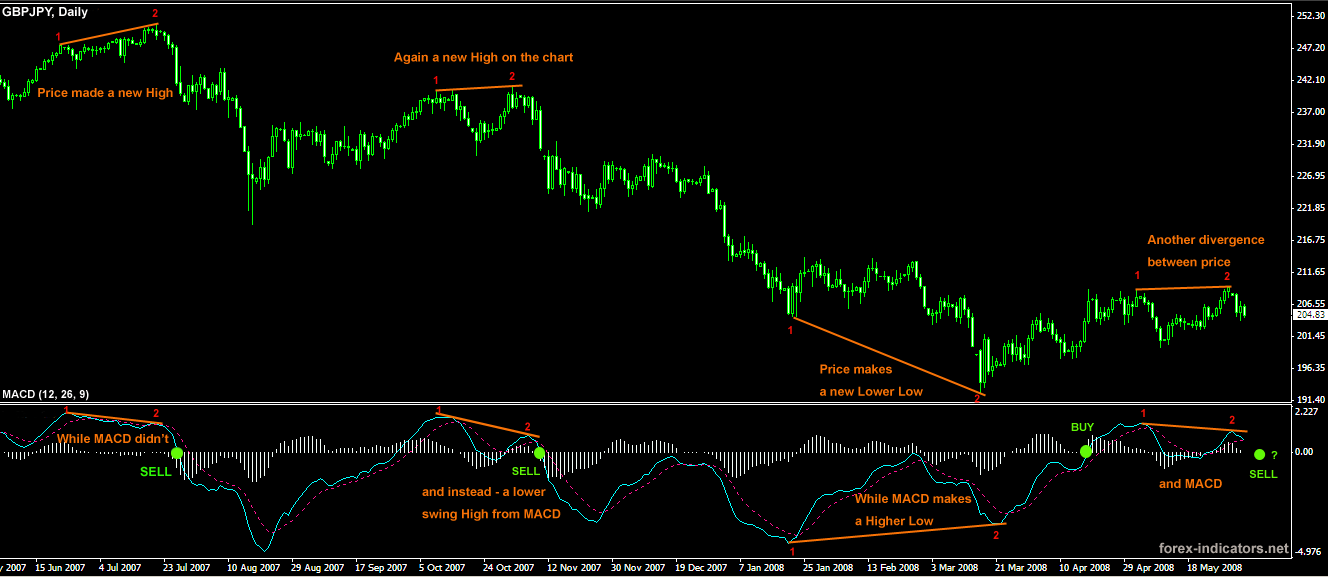
MACD histogram diverges from price on the chart — signal of an upcoming reversal.

Details

MACD is the simplest and very reliable indicators used by many Forex traders.
MACD (Moving Average Convergence/Divergence) has in its base Moving Averages.

It calculates and displays the difference between the two moving averages at any time. As the market moves, moving averages move with it, widening (diverging) when the market is trending and moving closer (converging) when the market is slowing down and possibility of a trend change arise.

Basics behind MACD indicator

Standard indicator settings for MACD (12, 26, 9) are used in many trading systems, and these are the setting that MACD developer Gerald Appel has found to be the most suitable for both faster and slower moving markets. In order to get a more responsive and faster performance from MACD one can can experiment with lowering MACD settings to, for example, MACD (6, 12, 5), MACD (7, 10, 5), MACD (5, 13, 8) etc.
These custom MACD settings will make indicator signal faster, however, the rate of false signals is going to increase.

MACD indicator is based on Moving Averages in their simplest form. MACD measures the difference between faster and slower moving average: 12 EMA and 26 EMA (standard).

MACD line is created when longer Moving Average is subtracted from shorter Moving Average. As a result a momentum oscillator is created that oscillates above and below zero and has no lower or upper limits. MACD also has a Trigger line. Combined in a simple lines crossover strategy, MACD line and trigger line crossover outperforms EMAs crossover.

Besides being early on crossovers MACD also is able to display where the chart EMAs have crossed: when MACD (12, 26, 9) flips over its zero line, if indicates that 12 EMA and 26 EMA on the chart have crossed.

Forex MACD

How does MACD indicator work

If to take 26 EMA and imagine that it is a flat line, then the distance between this line and 12 EMA would represent the distance from MACD line to indicator's zero line.
The further MACD line goes from zero line, the wider is the gap between 12EMA and 26 EMA on the chart. The closer MACD moves to zero line, the closer are 12 and 26 EMA.

MACD histogram measures the distance between MACD line and MACD trigger line.


Forex MACD trading

MACD indicator Formula

MACD = EMA(Close)period1 - EMA(Close)period2
Signal Line = EMA(MACD)period3

where
period1 = standard settings are 12 bars
period2 = standard 26 bars
perid3 = standard 9 bars

The following are the steps to calculate MACD

1. Calculate the 12-days EMA of closing price
2. Calculate the 26-days EMA of closing price
3. MACD = 12-days EMA - 26-days EMA
4. Signal Line = 9-days EMA of MACD

Formula for EMA

EMA = (SC X (CP - PE)) + PE

SC = Smoothing Constant (Number of days)
CP = Current Price
PE = Previous EMA

Trading MACD Divergence

MACD indicator is famous for its MACD Divergence trading method.

Divergence is found by comparing price shifts on the chart and MACD values.
MACD Divergence phenomenon occur as a result of shifting forces on the Forex market.
For example, while Sellers may seem to be dominating the market at the moment and price continues to trend down, there already might be signals for an overall weakening of Sellers power. This key warning moments can be observed with MACD indicator. What Forex traders would see is that despite price making new Lower Lows, MACD doesn't confirm that and instead registers a Higher Low, signaling that Sellers are running out of steam and a trend change is on its way.

Opposite will be true for Buyers.

How to trade MACD Divergence

When MACD line (on our screenshot it is a blue line) crosses Signal line (red dotted line) - we have a point (top or bottom) to evaluate. With two most recent MACD line tops or bottoms find corresponding tops/bottoms on the price chart. Connect MACD tops/bottoms and chart tops/bottoms.
Evaluate the lines received, as shown on the larger screenshot (click on the small picture to enlarge).

MACD divergence in Forex explained

With MACD divergence spotted Enter the market when MACD line crosses over its zero point.
Another entry strategy is to find 2 most recent swings high or low on the chart and draw a trend line trough them; and then set an Entry order on the breakout of that trend line.

MACD divergence trading method used not only to predict trend turning points, but also for trend confirmation. A current trend has high potentials to continue unchanged in case no divergence between MACD and price was established after most recent tops/bottoms evaluation.